PROJECT:
Customize It
Interactive eCommerce Experience & Its Content Management UX
CONTEXT:
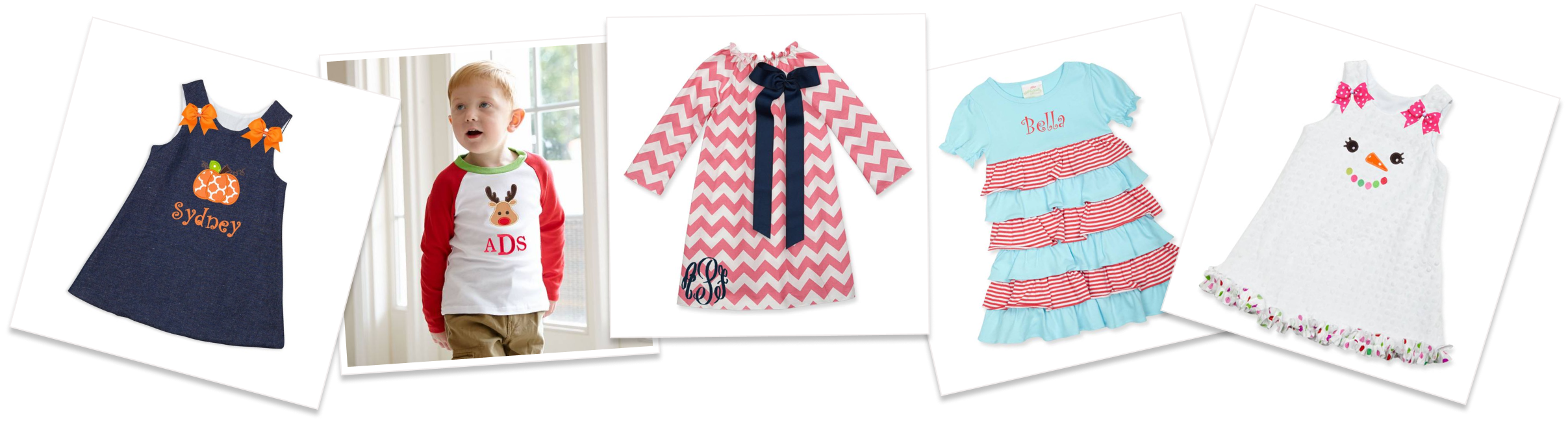
Lolly Wolly Doodle specialized in custom, made-to-order, women's & children's apparel.
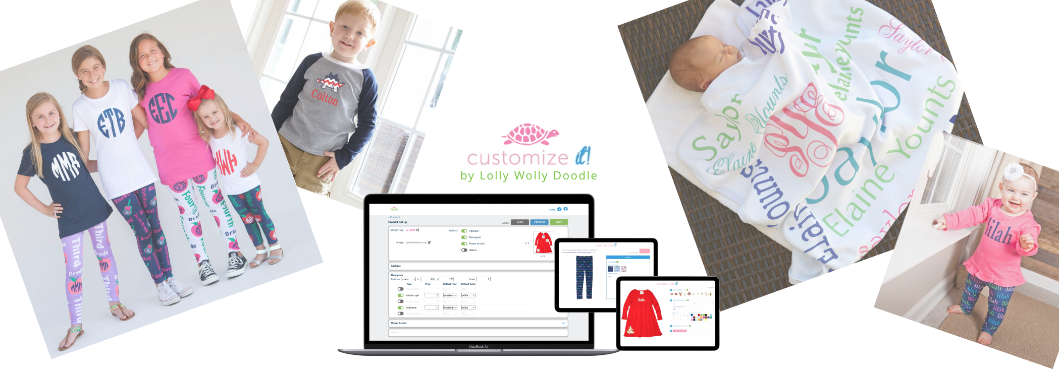
The “Customize It!” category of products allowed the customer to select and preview their own appliques, monograms, thread colors, and attachable accents.
This feature of the customer journey was one of the key facets that elevated the company above competitors.
While Customize It served as customer-facing UX, its content management system built for employees made the dev process really 2 simultaneous projects in 1.
MY ROLES:
- UX/UI Design
- Established Overall Product Process & Project Managed Ongoing Deliverables Between Departments
- Conceptualized Content Management & Product Set Up Page Requirements
- QA & Usability Testing
- Employee Presentation & Training
THE PROBLEM
As the personalized apparel market became more saturated, LWD needed to differentiate their customer experience from the competition in a big way.
SOLUTION & GOALS
- An interactive, dynamic product preview experience for wide-ranging item iterations
- An employee content management ux for product set up
- Streamlined cross-department process for ongoing new product creation
USERS:
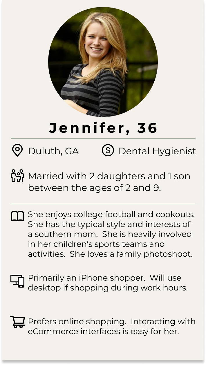
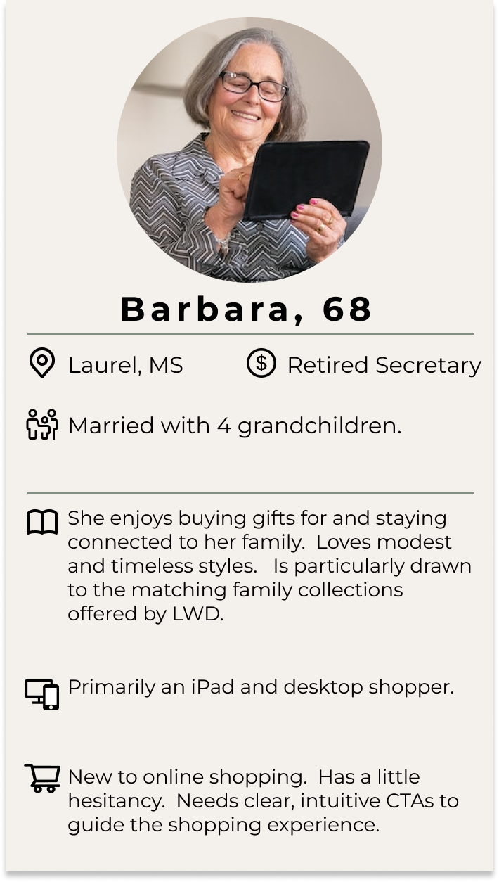
Thanks to years of Google Analytics and customer engagement, we had a very good understanding of our target audience and their needs on the customer-facing side of the project. We had 2 main personas we designed projects for.
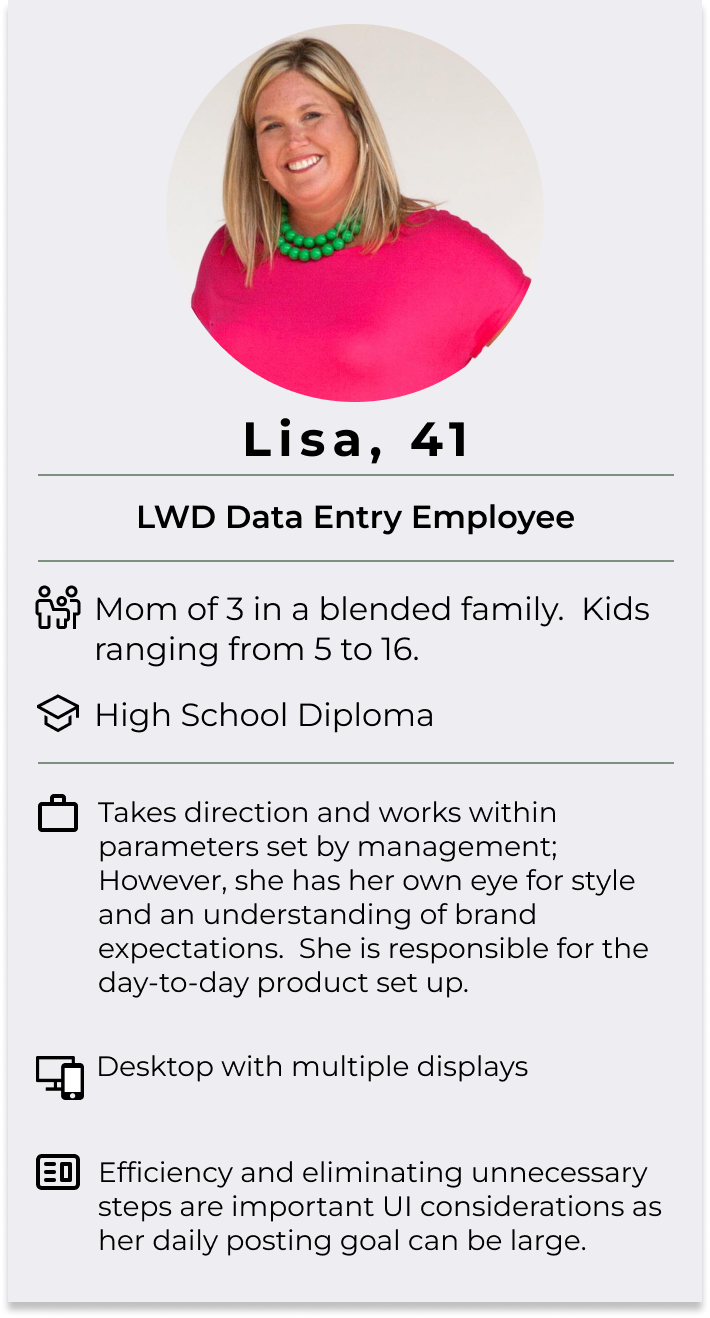
For the Content Management side of this project, I personally worked with and trained each of the users. I knew their needs and expectations of the project.
Customize It! Personas
Content Management Persona
Version 1 - Minimum Viable Product
Goals of v1:
- Create an MVP release for the most simple product types
- v1 will be desktop only
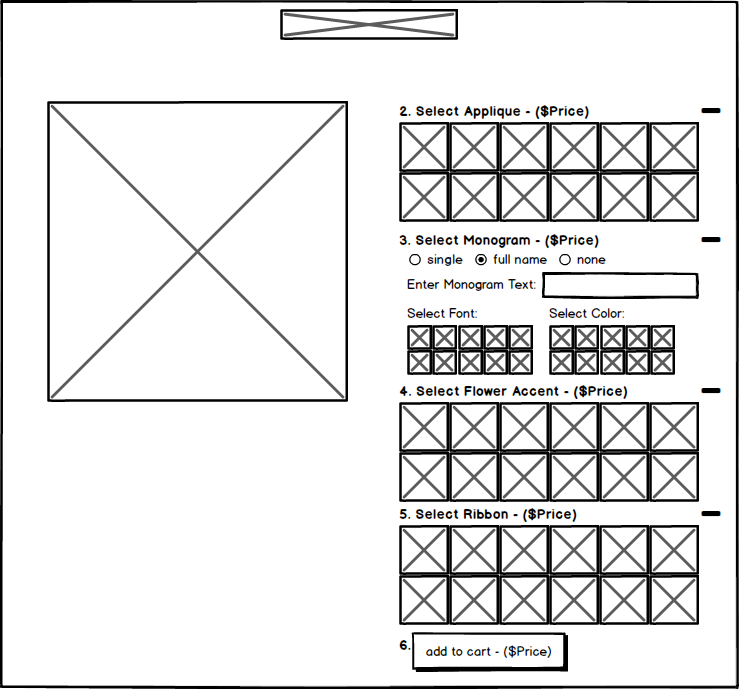
- Identify v1 customizable product options:
- appliques
- thread monograms
- flower accents
- ribbons
- shoulder bows
- Standardize a process for product option deliverables from apparel design team to tech developers
- Create content management pages and train employees to set up products
Customer Journey:
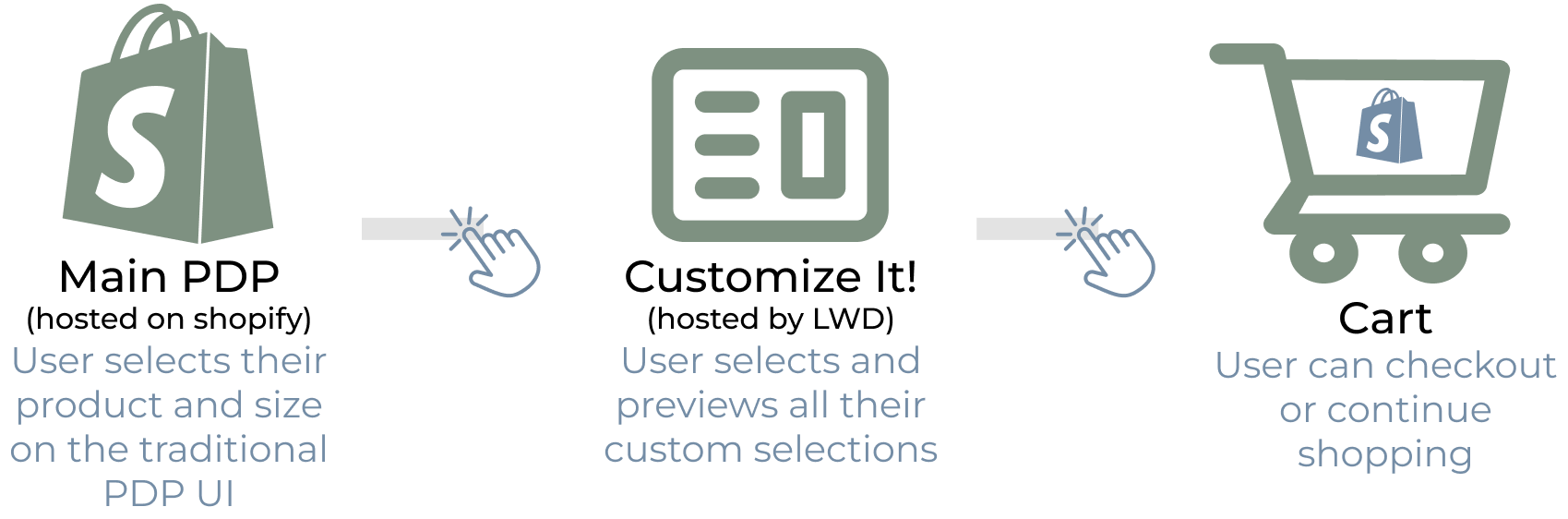
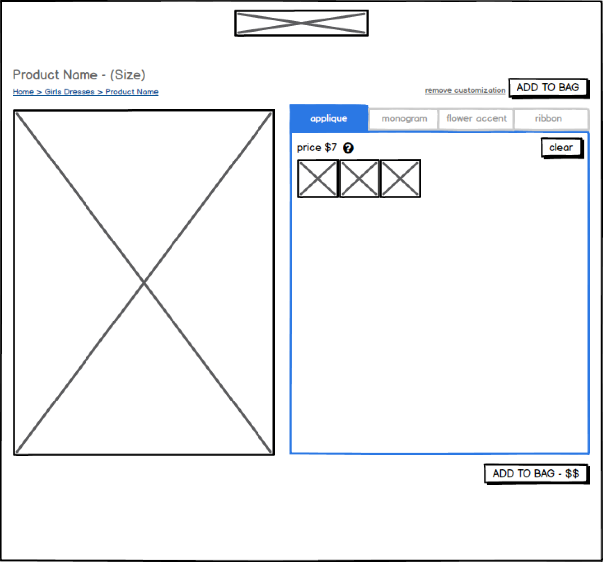
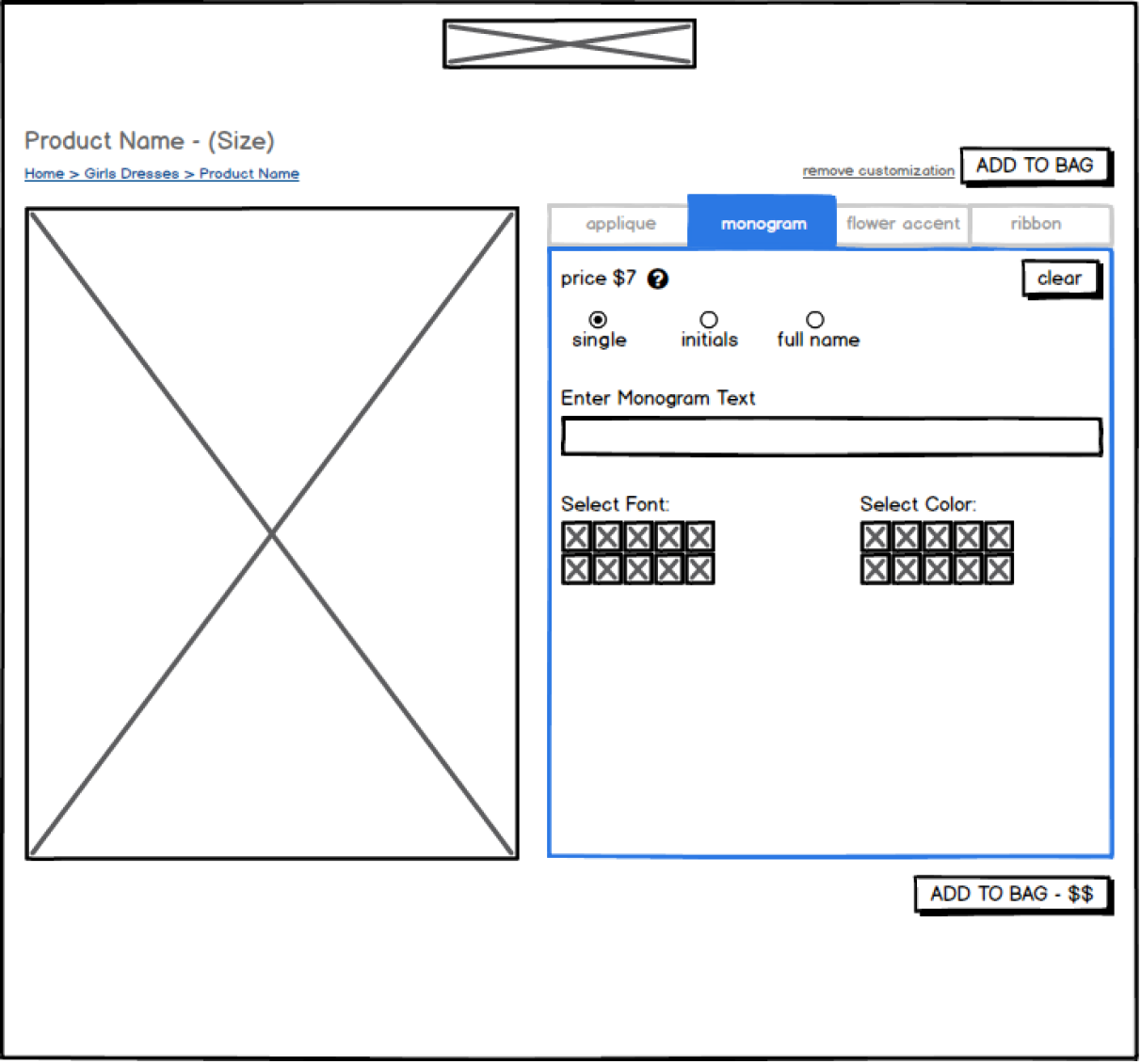
v1 Customer-Facing Product:
- Design Choices:
- Expand/collapse for each section with certain sections open or closed by default so view isn't overwhelming
- Numbered steps so no option is overlooked
- v1 was desktop only, so the side-by-side UI worked well for the viewport
- Add to bag CTA shows updated price as the user makes selections
LoFi Wireframe:
v1's Final UX:
Version 2 - Final Customer UX
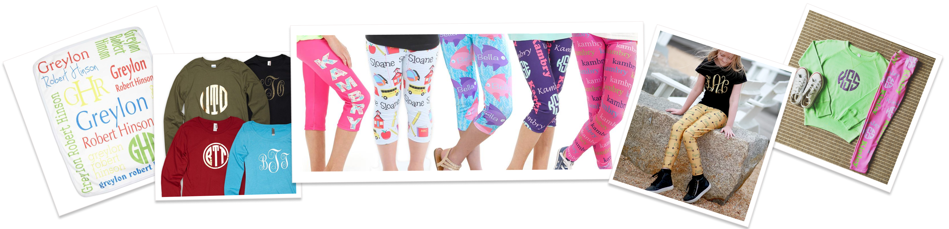
With v2, the main goal was to further separate our customer experience from the competitors. Our customized leggings had exploded in popularity. While there were a few competitors offering similar products, we wanted to be the only brand in the market to offer this kind of individualized experience to our users. Each product design was unique with individual needs and parameters. An efficient backend set up process would also need to be perfected.
Goals of v2:
- Incorporate complicated sublimated garments and create company
processes for those products
- Sublimated Products will have slightly different UIs compared to threaded traditional monogram products.
- Update existing UI based on testing and feedback
- Make design responsive across all devices
v2 Customer-Facing Product:
A) Threaded Monogram LoFi Wireframes:
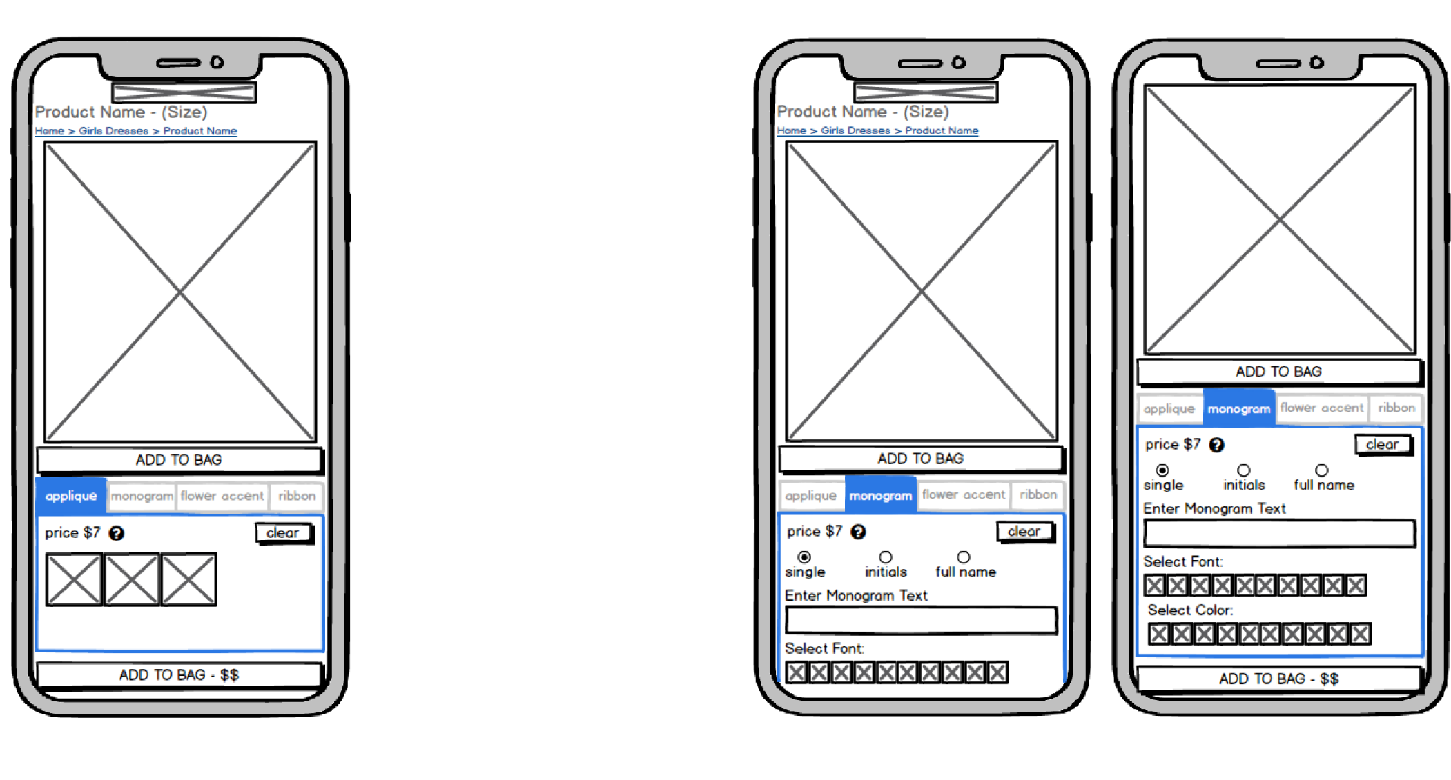
- The biggest change in the UI for existing threaded monogram products is splitting options into tabs. This gave the page a cleaner look with more options & reduced scrolling.
- One of the main goals of v2 was to create a responsive design that worked seamlessly for mobile users. The tabbed design was perfect for the mobile UI.
- The add to bag button was not sticky in order to force the user to scroll past all options.
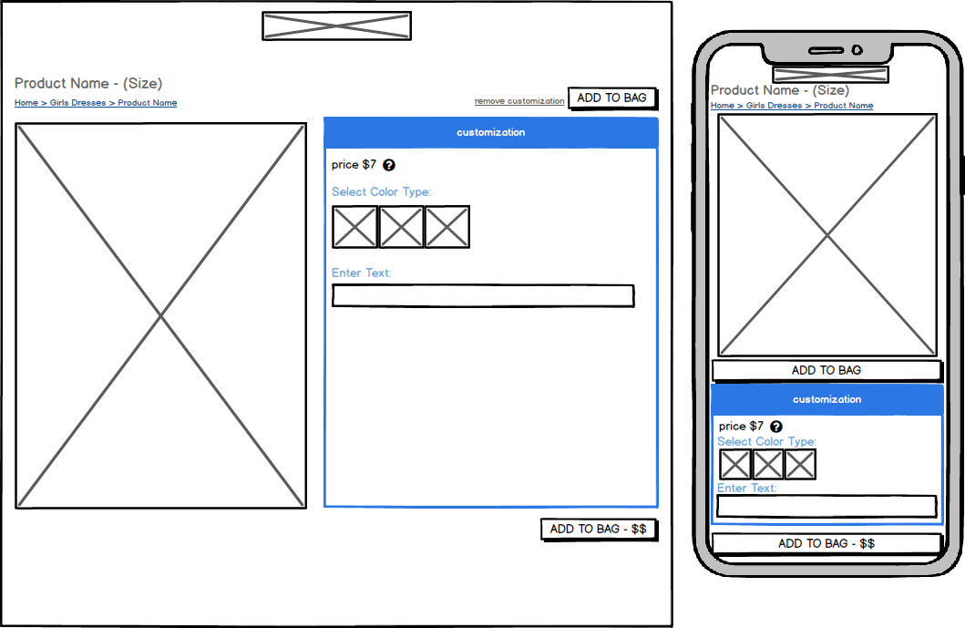
B) Sublimated Products:
- Sublimated Products were their own beast. The UI was consistently 1 tab, but choices and entry fields varied on the needs of the individual items.
- Each colorway offered was displayed as a selectable thumbnail.
- I deteremined display/product constraints & character breakpoints for EACH design in a QA environment before it was pushed to live products.
Sublimated Product LoFi Wireframes:
v2's Final Sublimated Product UX:
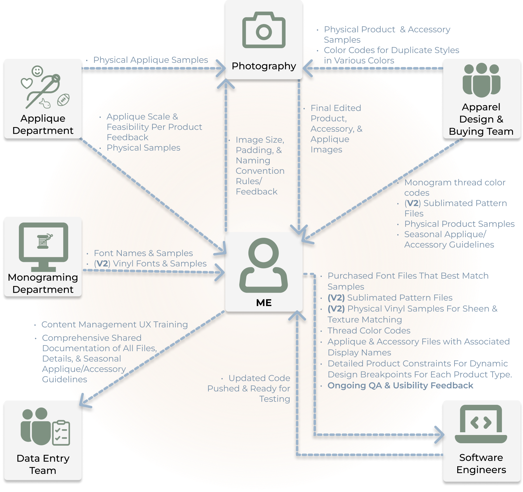
Product & Content Management Processes:
As part of the MVP v1 release, the scope of what was needed for the Content Management System was pretty large. Before I wireframed the CMS, the engineers and I collaborated with sample assets on the customer-facing UI so we could lay a foundation for the files and information needed from the CMS by the customer-facing page.
Initial Deliverables:
- All v1 Products, appliques, and accessories needed to be identified & photographed
- All photography needed standardized whitespace, size, and quality guidelines
- All offered fonts needed best match options found and purchased for commercial use
- All offered thread colors needed best match color codes
- All options need concise, standardized, naming conventions
CMS - Product Set Up HiFi Wireframes:
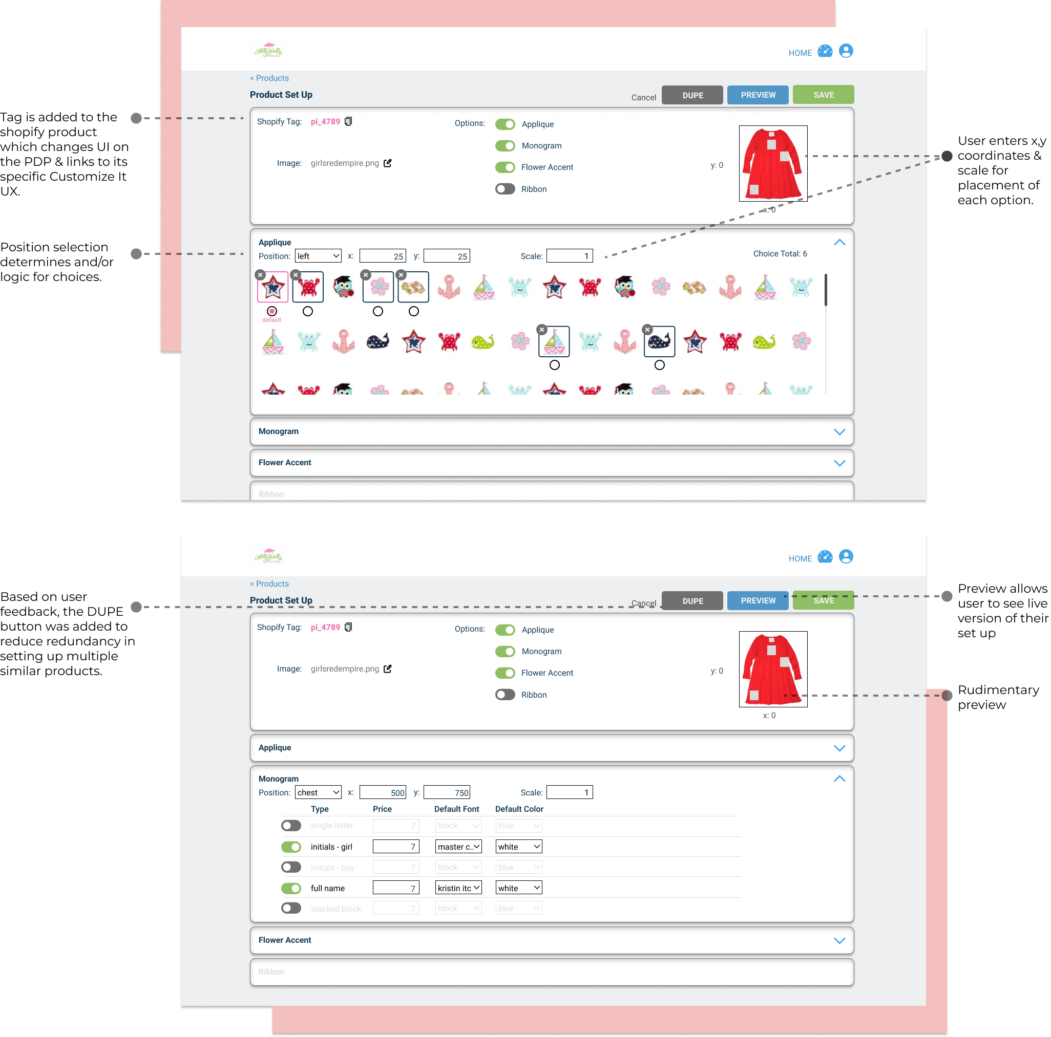
Final Functioning Product & Content Management Process:
REFLECTIONS:
Despite the simplicity reflected in the UI, elaborate cross-team collaboration was required for Customize It. With numerous moving parts and deliverables in constant flux, the team rose to the occasion each day.
This project provided our customers with an interactive product experience they couldn't find elsewhere. This was especially true when it came to custom personalized leggings and the ability to see a live, accurate preview of their garment. It truly elevated LWD to the top of the market for custom leggings for a period.

